- Address : P9FG+V4R, Shimutala, Matigara, Baniakhari
- /
- Email : splogos2022@gmail.com
- Home
- -Blogs Details
Blogs Details
- Nov 20,2024
- Admin
Responsive vs Website Design War
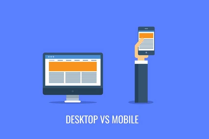
The debate between responsive design and traditional website design has become more significant than ever. As mobile usage continues to dominate, the need for websites to function seamlessly across all screen sizes is no longer optional—it's essential. Responsive design automatically adjusts layout and content to fit various devices, providing a consistent and user-friendly experience whether viewed on a phone, tablet, or desktop.
Traditional, fixed-layout designs, on the other hand, may look good on desktops but can struggle to deliver the same experience on smaller screens. This limitation can lead to poor usability, increased bounce rates, and lost opportunities. In today’s digital environment, users expect speed, clarity, and accessibility wherever they are. The war between these two approaches isn’t just about aesthetics—it's about functionality, performance, and user satisfaction.
Responsive design has clearly taken the lead as the preferred choice, aligning with modern browsing habits and search engine standards. However, the debate still highlights the broader challenge of keeping up with evolving technologies and user expectations.
Latest posts
-
 Aug 01,2025
Why AI agents need i ...
-
 Jul 15,2025
Why understanding so ...
-
 Jun 30,2025
New guidance for lat ...