- Address : P9FG+V4R, Shimutala, Matigara, Baniakhari
- /
- Email : splogos2022@gmail.com
- Home
- -Blogs Details
Blogs Details
- Feb 20,2025
- Admin
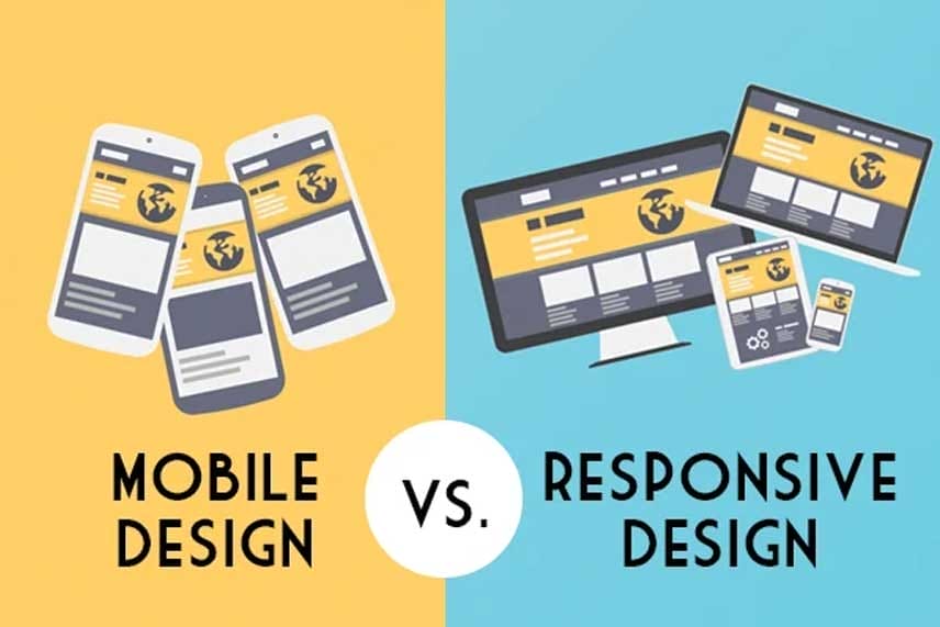
Responsive Design vs Apps Design
Responsive Design vs. App Design represents two different approaches to delivering digital experiences, each with its own purpose, strengths, and limitations.
Responsive design refers to websites that automatically adapt their layout and content to fit different screen sizes—desktops, tablets, and mobile phones—using a single codebase. It’s browser-based, cost-effective, and ideal for reaching a broad audience without needing users to download anything. Responsive sites are easier to maintain and update, and they're SEO-friendly since they live on the web.
App design, on the other hand, is specifically tailored for mobile apps installed on devices (iOS or Android). Apps offer deeper integration with device hardware, faster performance, offline access, and personalized user experiences. They’re often more interactive and immersive than websites but require separate development for each platform, making them more resource-intensive to build and maintain.
The choice between responsive design and app design depends on your business goals, target audience, and the kind of experience you want to offer. Responsive design is ideal for accessibility and broad reach, while apps are best when speed, personalization, and offline capabilities are critical. In some cases, businesses benefit from using both to serve users effectively across all touchpoints.
Latest posts
-
 Aug 01,2025
Why AI agents need i ...
-
 Jul 15,2025
Why understanding so ...
-
 Jun 30,2025
New guidance for lat ...