- Address : P9FG+V4R, Shimutala, Matigara, Baniakhari
- /
- Email : splogos2022@gmail.com
- Home
- -Blogs Details
Blogs Details

- Nov 30,2022
- Admin
Are you Ready for a Multi-Device Website?
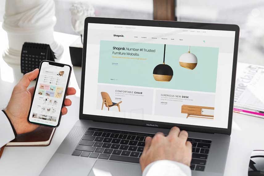
Being ready for a multi-device website means ensuring that your site delivers a seamless and consistent experience across desktops, laptops, tablets, and smartphones. Users now access websites from a variety of screen sizes and devices, and they expect content to be easy to read, navigate, and interact with regardless of how they view it. This involves more than just resizing images or text—it requires thoughtful design choices, flexible layouts, and responsive frameworks that adapt automatically to different devices.
Your website should load quickly, function smoothly, and present key information clearly, whether someone is using a mouse, a touchscreen, or a keyboard. This also includes making sure buttons are easy to tap, fonts are legible at smaller sizes, and navigation menus are intuitive and accessible. Beyond visuals, multi-device readiness includes testing for performance, usability, and compatibility across browsers and operating systems.
If your current website doesn’t adapt well to mobile or tablet users, it could lead to frustration, increased bounce rates, and lost opportunities. Being prepared for a multi-device world is not just a design trend—it’s a fundamental requirement for reaching and retaining your audience in today’s digital landscape.


